 English
Designer #
If you need to create pages or screens and do not have a team in charge of such developments, Prisma Campaigns allows creating those resources without the need for programming or design knowledge. In other words, it is possible to create banners, data capture forms and even complete landing pages easily and quickly - both in their web version and natively for other devices.
This section details the general considerations of the use of the designer. However, in the examples below it is used in the context of creating a funnel step but without considering the particularities of that specific use.
Creating a New Page #
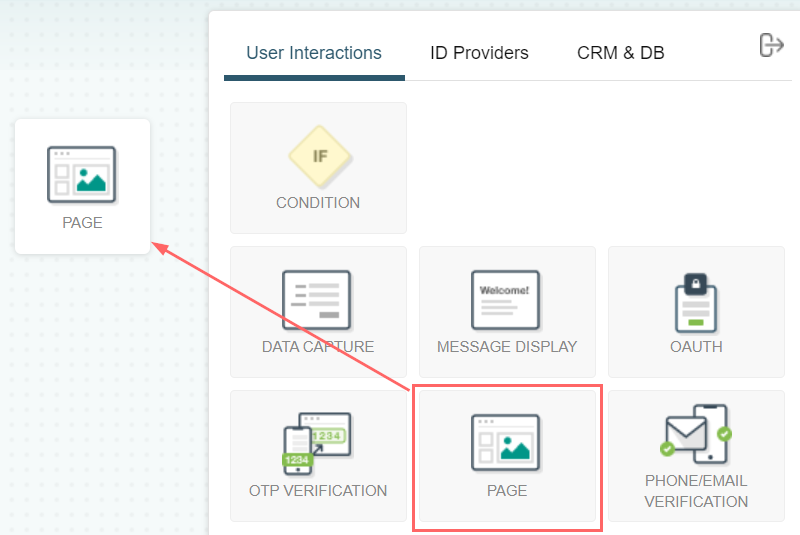
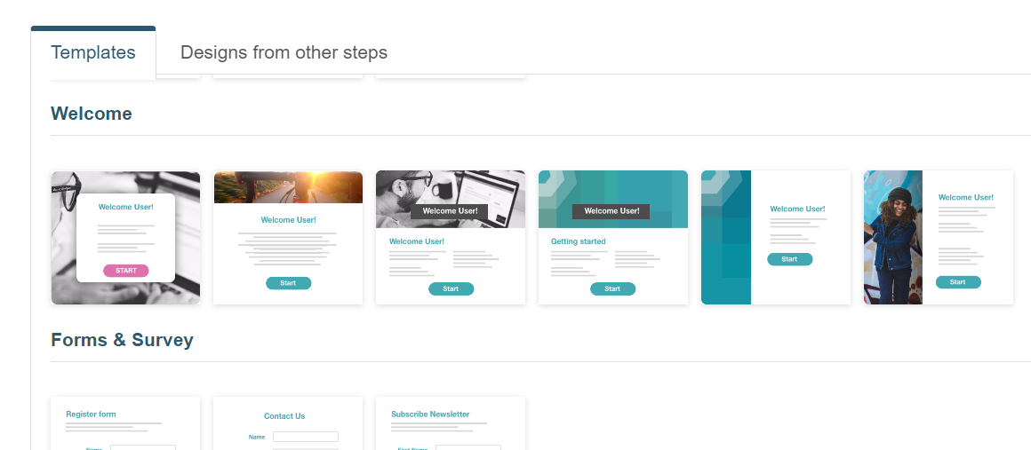
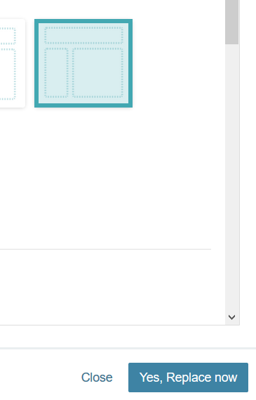
After selecting Page and clicking on Next, you will be allowed to choose a template from several available ones. You will use this template as the basis to create and edit the page. The following image shows the existing alternatives, which consist of:
Blank pages
Simple designs with rows and columns
Pre-designed pages with formatted text and images
Designs made previously and used in other funnel steps
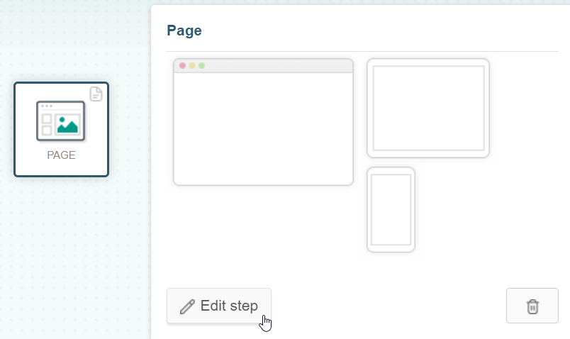
After you select a template, the Yes, Replace now now button will be enabled to start creating the page through the designer.
The main view of the tool is shown below and consists of 4 sections:
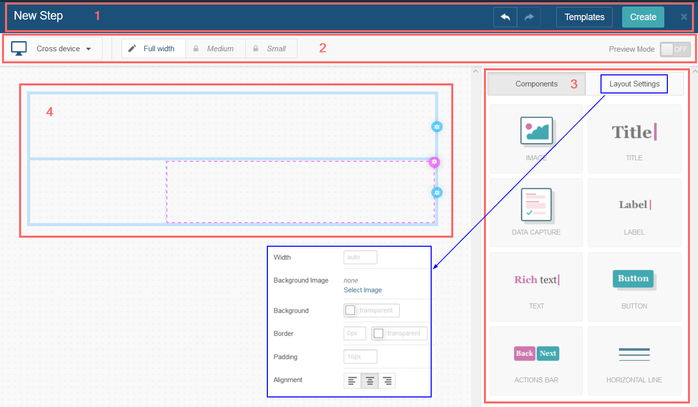
From the main menu, you can undo and redo changes, open the selection dialog to change the template, and finally confirm the creation of the page with the Create button. It is important to remember that the latter will read Update once we have created the page and are editing it.
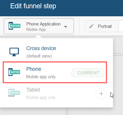
To examine the appearance and content of the page, you can choose the initial device and enable the preview mode through the switch on the far right. By default, the designer uses a generic screen size, although two additional types are also available (Phone and Tablet). To select the screen type and create more mobile pages, use the drop-down list. The latter case is particularly useful for taking advantage of the distinctive features of this type of device (camera, microphone, QR code reader, etc.).
For example, to create a new page specially designed for phones, you must display the list (which initially shows the text Cross-device) and click on the + sign to the right of Phone. As the next step, it is necessary to indicate if you want to keep the current elements in the page or generate a new blank page and click on Create.
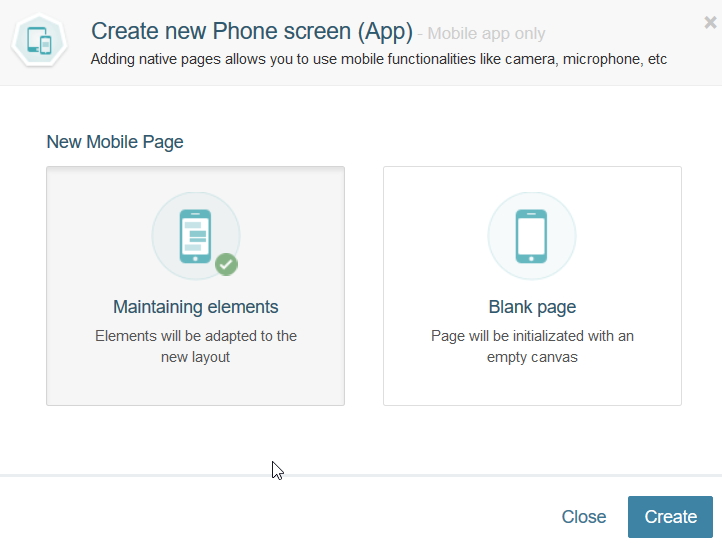
It is important to clarify that, if you choose the first option, the layout of the content will be adapted to the screen size but without modifying it.
In either case, you can alternate between the portrait and landscape views. The following image shows the latter as active:
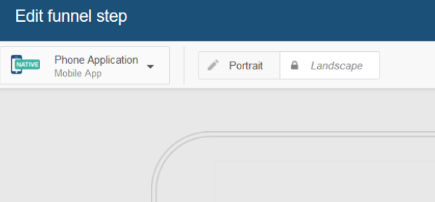
At this point, the drop-down list shows that the current device you are working with is of type Phone:
If necessary, we can continue with the current device, create a new page optimized for tablets, or return to Cross device at any time.
- The available components are:
Layout:
- Tabs
- Accordion
- Panel
- Horizontal stack
Elements:
- Titles (headings)
- Labels
- Rich text
- Images
- Buttons
- Horizontal line
Forms:
- Action or navigation bar
- Data capture
- Re-captcha
- File uploader
- Terms and conditions
- Multivalue
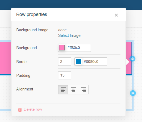
You can configure the width, the image or background color, the border, the spacing, and the alignment of the content from the Layout Settings tab.
4. In the work area, the desired components can be placed on the previously chosen layout. You can think of this template as a grid consisting of a series of rows and columns, and you can add more inside each one. The previous image shows two rows: the upper one contains only one column, while the lower one is composed of two. Each row and column has its own set of specifications, which you can access by clicking on the light blue (for the configuration of individual rows) or pink icons (columns) that appear when you position the cursor over them. From the same dialog, it is possible to delete a row or column through the corresponding link (Delete row or Delete column, respectively).
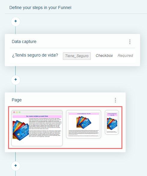
To save these changes, use the Create button. This action will close the designer and place us back at the starting point. For example, in the following image, you can see the newly created page as a funnel step. Also, you can see its thumbnail display for different types of screens:
The use of the different components listed above merits the detailed explanation provided in the following section.
Page Components #
As mentioned above, the designer includes several components that allow you to create a fully functional page by simply dragging them into the workspace. Each one of them has its distinctive characteristics that we present below.
Images #
When you insert an image component in a cell, you can perform the following operations:
Upload an image.
Indicate the image’s size (width and length) and the desired space (Padding) between the image and the cell borders.
Specify the size and optional color of the border that will surround the image.
Add a background color, alternate text, and a target URL.
Set the opacity or transparency level of the image (the higher the opacity value, the lower the transparency).
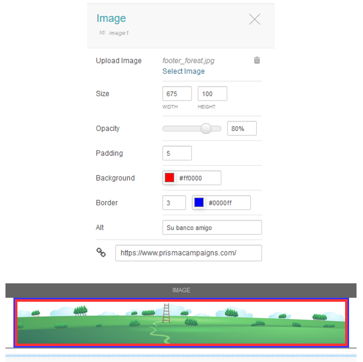
In the above figure we can see:
The image file used is footer_forest.jpg.
The specified size is 675 x 100 pixels.
The opacity is 80%.
The chosen red background highlights a space of 5 pixels between the image and the edge of the cell.
The cell border is 3 pixels and blue.
If the image does not load correctly, the text Su banco amigo will be displayed instead.
The destination URL the image points to is the Prisma Campaigns website.
You can edit any of these attributes in the same way you set it, and you can even delete the image or replace it with a different one.
Titles (Headings) #
You will use this component when you want to get the customer’s attention through a short message, often as an introduction to the content of the same or adjacent cells. The settings that you can configure in it include font type, size, color, formatting (italics and/or bold), and text alignment.
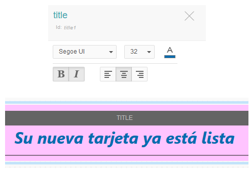
The example above shows the use of the Segoe UI font in size 32 and navy blue. The text itself also appears in italics and bold and is aligned to the center of the component.
Data Capture (Forms) #
Initially, you can add as many fields as necessary to an empty form. First, you set the desired alignment of the controls inside of it and the space to the component’s borders (15 pixels in this case).
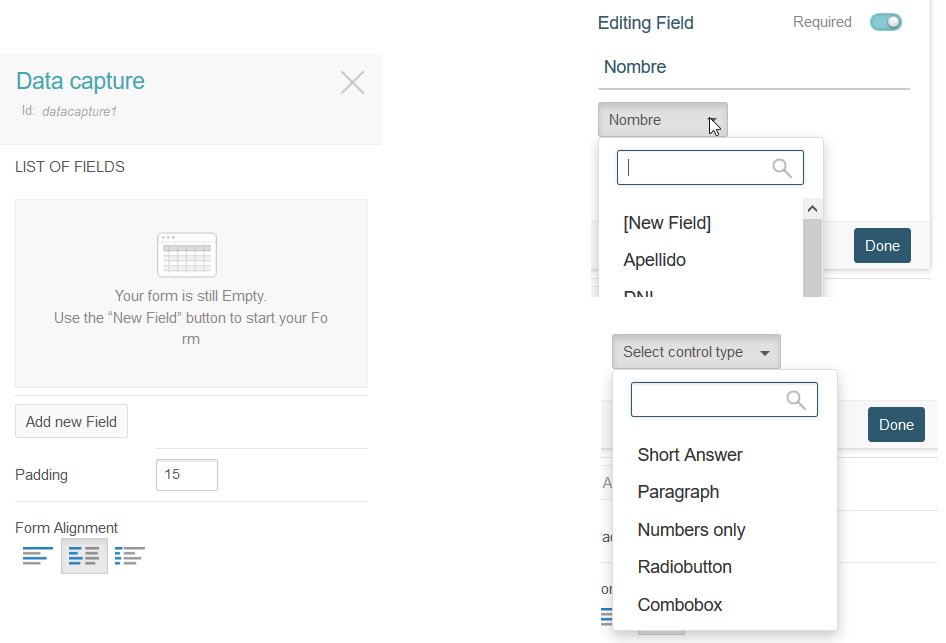
After clicking on Add new Field, you can indicate:
- The identification label, if it will be required or not, and the field name of the client model with which it will be associated. Another option here is to create a new field as a result of the data entry process. In the image above, the label is called Nombre and is related to the customer model field with the same name.
The type of control associated with the field. The available options are short answer, paragraph, numbers, radio button, and checkbox.
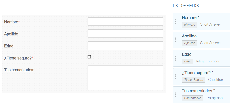
After adding fields of various types from those mentioned above, the form looks as follows:
Labels and Rich Text #
Labels are identical to one of the components we mentioned above (titles). On the other hand, the rich text component allows not only to add text, but also to change its font and background color, to add lists, links, and even images:
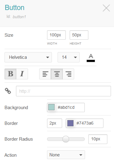
Buttons #
When you add a button to the work area, you need to indicate:
Size (width and height).
Desired font, color, and alignment of the text inside the button.
Additional formatting (italic and/or bold), background, and target link.
Action to be performed. Choose Next from the drop-down list if the button should lead to the next step.
Action or Navigation Bar #
While this component consists primarily of two buttons, it is much more than that. It allows us to move to a previous or next step, to cancel the funnel, or even to dismiss the campaign (if this action is allowed):
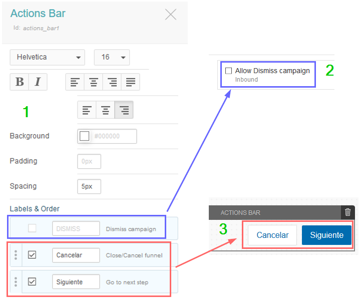
In the image shown above you will see the following areas:
After adding an action bar, you specify the text of the buttons and their content, formatting, orientation, and spacing, among other things.
Because the option to disable it is disabled in the campaign configuration, the corresponding option will not be available in the action bar. Otherwise, a link will appear at the bottom of the bar with the legend I am not interested in this offer.
In the designer’s work area, you can see how the buttons in the action bar look.
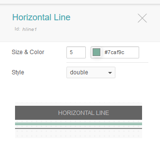
Horizontal Line #
This component has an aesthetic purpose and serves as a section separator. You can change its initial color, style (continuous or discontinuous stroke, dotted, or double), and size (in pixels).
Each new component you add to the page receives a unique identifier (which distinguishes it from the others) within the HTML code generated for the page.
File Uploader #
If you want to receive a file from your customers, you can allow them to attach one using the control called File Uploader. To do this, it is necessary to have a field of type File in the campaign’s data model. You will need to link this field with the component and indicate the following:
Whether the file upload is required or optional
File type (documents, images, and compressed files)
Maximum size allowed in KB
Width and height of the component in the page
Background color
Width and border color
Padding
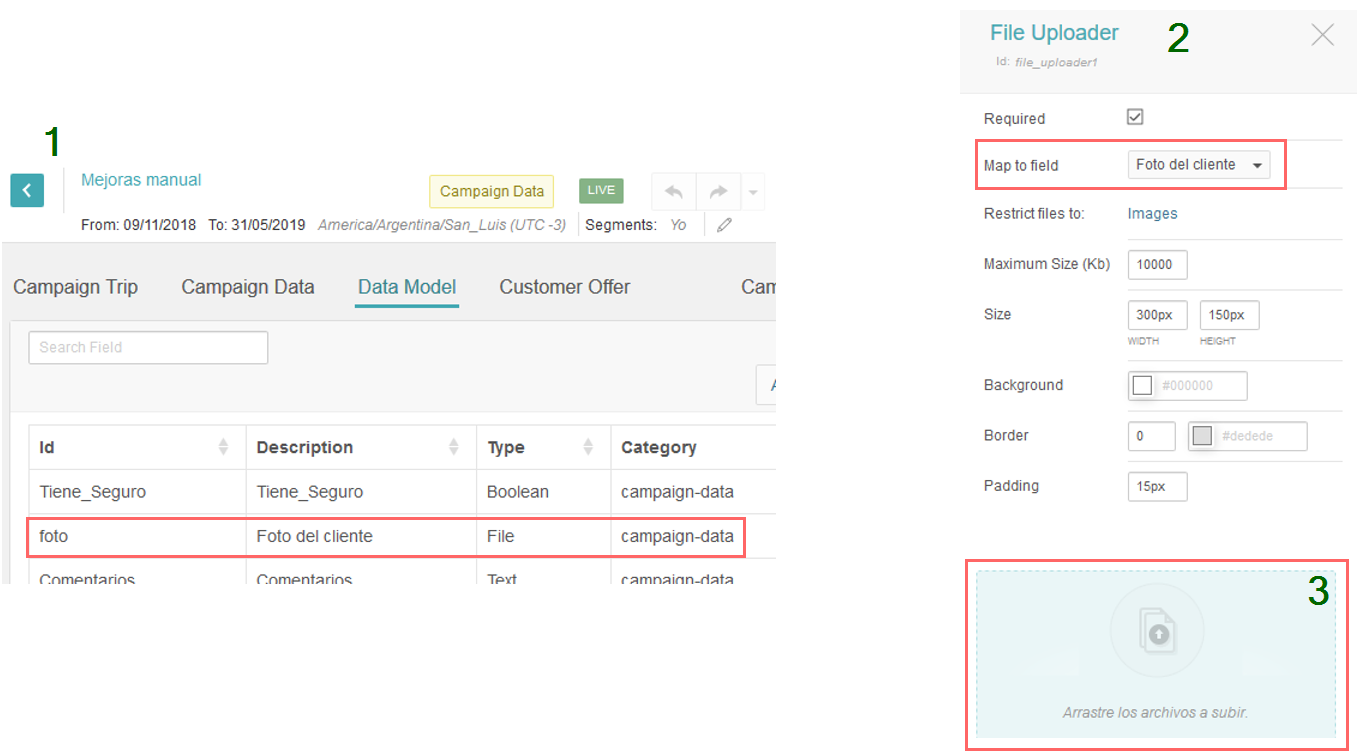
In the previous figure you can see:
The use of a field called foto (whose description in the data template is Foto del cliente).
This field is associated with a file uploader control.
The customer can upload a picture by clicking on the component to open a file selection dialog. It is also possible to perform the same operation by dragging and dropping a file on the component itself.
This component provides the possibility for the client to send image files as proof of identity, scanned certificates to verify data, or any other special communication needs that may arise.
Captcha #
As a security measure, you can consider including this component both in a designer page and in a data capture step or when displaying a message. By doing so, you can distinguish between a human response and an automated computer response before actually sending the data.
Before you can utilize this component in a page, you need to configure the integration with the service provided by Google. To do that, go to Settings/API Integrations in Prisma Campaigns.
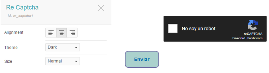
The above image illustrates how you can use the component on a page. In this particular case, the configuration uses the dark theme and aligns the control at the center of the form.
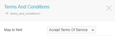
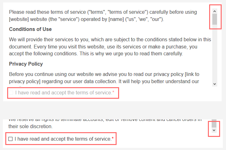
Terms and Conditions #
To ask your customers to accept the norms or rules regulating the service, this component allows you to include both an informative text and a checkbox. In order to store the decision, the component requires a Boolean field at the global or campaign level to be selected from the Map to field drop-down list. In the image below, you can see the use of a field whose description is Accept Terms of Service for this purpose:
There are three design alternatives:
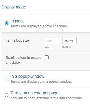
- Show the terms above the checkbox in place
- Display the text in a popup window
- Include a link to an external page that contains the conditions
In the first two options, it is possible to make the client scroll to the end of the text before enabling the checkbox for use. To do this, check the option Scroll bottom to enable checkbox shown in the image above. On the other hand, you will need to display a link to open the popup or launch the external page. This can be accomplished by enclosing the correct words with curly brackets:
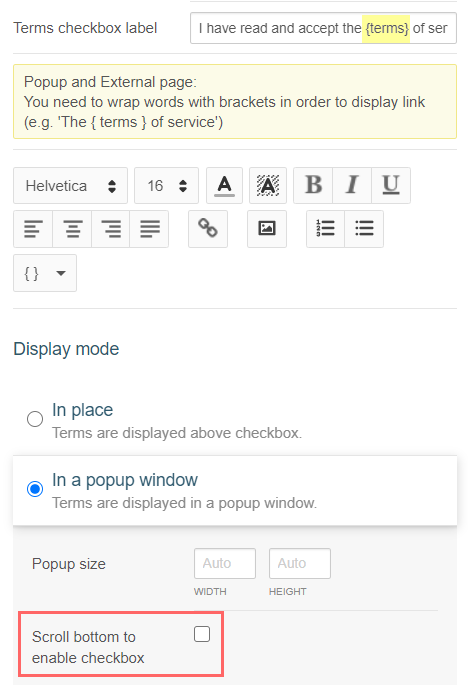
The image below shows the component where the text and the checkbox are displayed together. Also, we can see that the latter remains disabled until the bottom of the document is reached:
Panel #
The panel component serves as an organizational tool for structuring content while designing pages. Think of content as other designer components as described in this page. It provides a bordered container with a header, title, and formatting options like background color, padding, and alignment for the content.
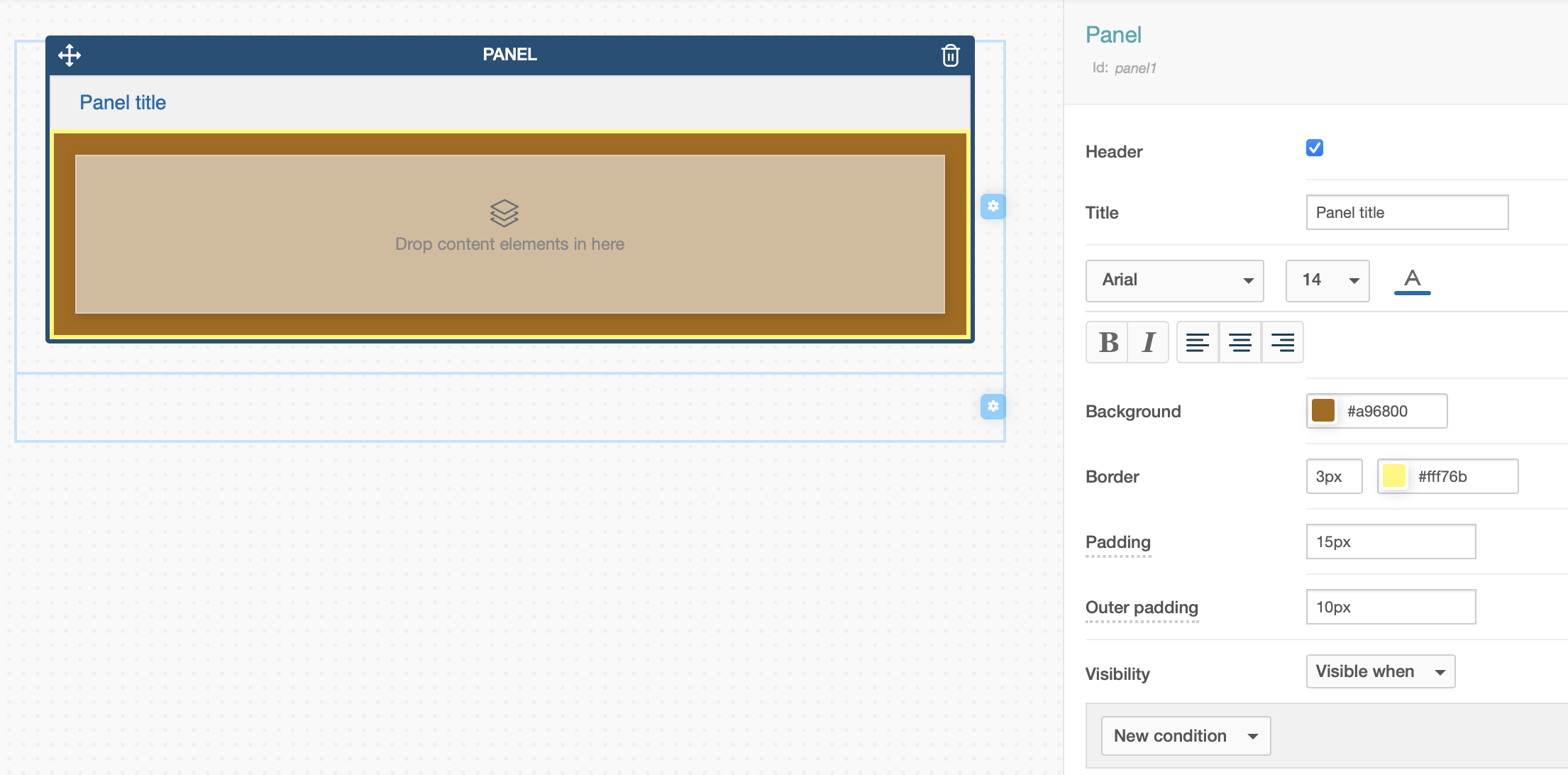
In summary, this component groups content into logical sections and improves the overall structure of your page design.
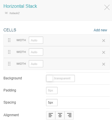
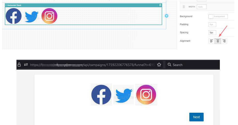
Horizontal Stack #
This component facilitates the task of inserting and rearranging content horizontally. Although you can achieve a similar result with columns, the horizontal stack provides more spacing options between elements. In addition, it allows you to relocate content to other areas of the design easily.
After adding the horizontal stack on a page, you can append more cells to the default ones. It is also possible to delete existing cells and modify attributes such as width or spacing individually. You can also adjust the background, its alignment, and the identifier for the underlying HTML. The image below shows the initial values of these fields:
A classic use case for the horizontal stack is to display social media icons. To do this, you can place an image component in each cell and add the corresponding file on top of it. This is illustrated below:
- Blank horizontal stack
- Two images in the first cells, while the last one appears empty.
- A third image in the list.
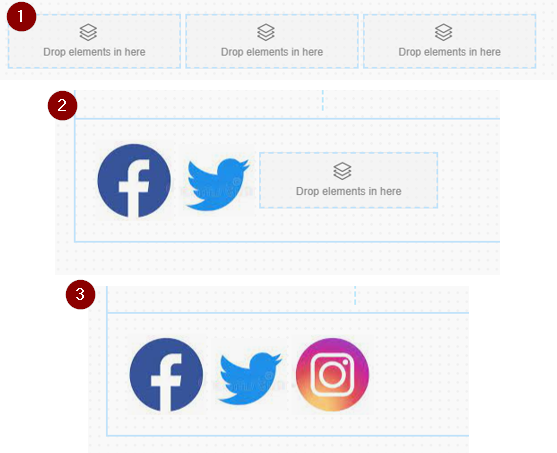
In the final result, the content positioning is determined by the configuration of the component. Below is the alignment of the horizontal stack and its display in a campaign funnel:
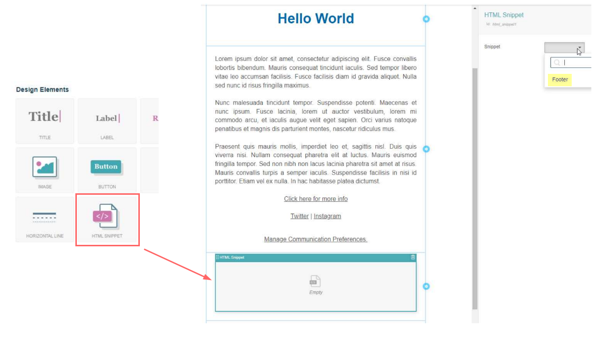
HTML Snippets #
HTML snippets are a solution to extend the capabilities of the user-friendly page designer. These snippets, which can include custom HTML, CSS, or JavaScript, provide a way to bridge the gap between the simplicity of prebuilt components and the desire for advanced design control.
After creating a new HTML snippet as explained in the Settings section, you can include it in a page by dragging the corresponding component to the desired location. Then, you can select the snippet from the drop-down list (for example, Footer in the following image):
Multivalue #
This component allows you to display a list with multiple values from a field of type many in the user or campaign’s data model. The multivalue field can correspond either to a single value or a more complex structure in the form of a JSON schema.
Additionally, the component’s configuration includes the following options for each case:
- Single value: label (client-side) and control type (short answer, password, paragraph, numbers only, radio button, or combobox).
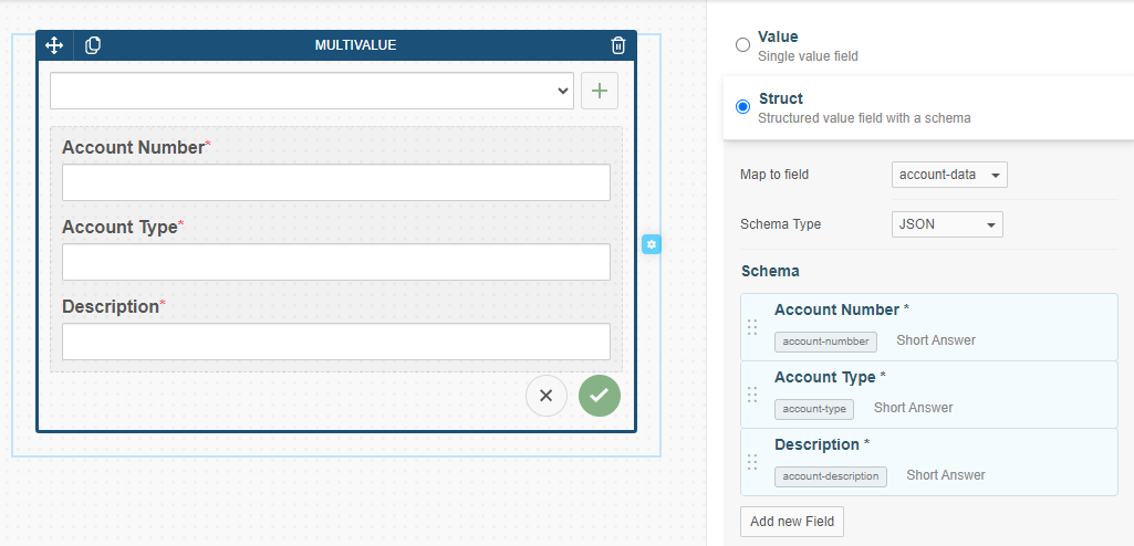
- Struct: label (client-side) and field name (database) for each field in the schema, as well as the control type to be used.
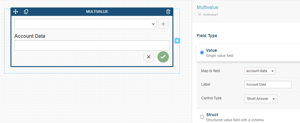
In the example above, the user has configured the component to display the values of the field account-data from the user data model. The label Account Data will be displayed above the list, and the control type to add new values will be Short Answer. Note that the user can add as many values as needed by clicking on the Add button.
The values added by the user manually will undergo validation according to the field’s configuration.
If, on the other hand, the field is a complex structure, the user must select the field to map and add as many fields to the schema as needed. In the same fashion as in the previous case, each field in the schema must have an associated control type to display its value. The following image shows the configuration of a multivalue component with fields Account Number, Account Type, and Description that are mapped to account-number, account-type, and description, respectively:
Email Components #
The email designer includes a wide variety of components that we can drag and drop into the edition area. This makes it possible to give the message the intended look and functionality. Besides the generic components (titles, labels, rich text, images, buttons, hyperlinks, horizontal lines, and HTML snippets), the following are specific to this tool.
Dynamic Button #
The dynamic button can be added in reusable email templates to define generic style and structure and also customize specific details for each campaign. This element is ideal for templates where the main call to action needs to change depending on the campaign’s context.
Configuring a Dynamic Button #
To use the dynamic button, navigate to the Design Elements area after choosing the template in Settings/Email Templates or creating a new one. You will find the dynamic button under the Dynamic category. To begin, drag and drop the component into your template layout:

Once placed in the template, you can then configure its specific properties in the campaign settings where it will be used. The following options are available after adding the template in the email channel and clicking on the dynamic button to edit it:

- Button Label: An input field to set the text displayed on the button (e.g., “Click Here!”).
- Typography: Customize the font family, size, and style (Bold, Italic, Alignment).
- Size: Define the exact width and height of the button in pixels.
- Background: Use the color picker to select the button’s background color.
- Border: Set the border thickness (in pixels) and color.
- Border Radius: Adjust the roundness of the button’s corners using a slider (e.g., 0px for sharp corners, 20px for fully rounded).
- Button Alignment: Align the button within its container (Left, Center, Right, or Justified).
- Action: Select the button’s function from a dropdown menu (None, Campaign CTA, Custom Link).
By configuring these properties at the campaign level, you can reuse the same email template across multiple marketing efforts, quickly adapting the primary call to action without having to rebuild the template each time.
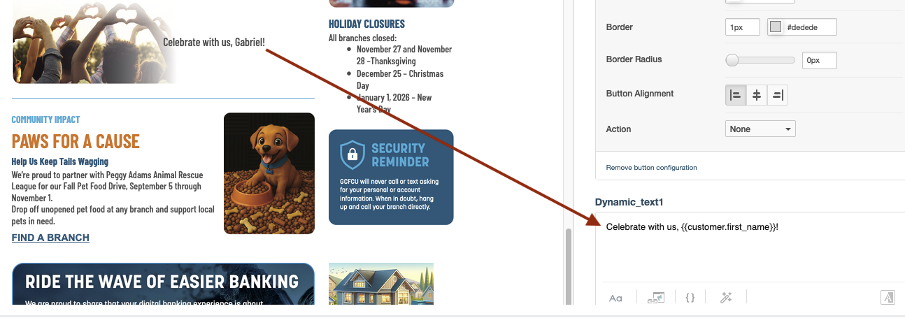
Dynamic Text #
The dynamic text component can be added in reusable email templates to define generic text content and also customize specific details for each campaign. Just like the dynamic button, this component is ideal for templates where at least part ofthe message content needs to change depending on the campaign’s context.
Configuring Dynamic Text #
To use the dynamic text component, navigate to the Design Elements area in the channel configuration after choosing the template from Settings/Email Templates or creating a new one. You will find the dynamic text component under the Dynamic category. To begin, drag and drop the component into your template layout:
Once placed in the template, you can then configure its specific content in the campaign settings where it will be used. The following options are available after adding the template in the email channel and clicking on the dynamic text component to edit it:
- Dynamic Text Field: An input field where you can enter text content and use variables such as
{{customer.first_name}}to personalize the message for each recipient. - Text Formatting: Access formatting options including font styles, text alignment, background color, etc.
By configuring the text content at the campaign level, you can reuse the same email template across multiple marketing efforts, quickly adapting the message text without having to rebuild the template each time.
Dynamic Image #
The dynamic image component can be added in reusable email templates to define generic image placeholders and also customize specific details for each campaign. As the other dynamic components, this element is ideal for templates where the image content needs to change depending on the campaign’s context.
Configuring Dynamic Image #
To use the dynamic image component, navigate to the Design Elements area in the channel configuration after choosing the template in Settings/Email Templates or creating a new one. You will find the dynamic image component under the Dynamic category. To begin, drag and drop the component into your template layout:
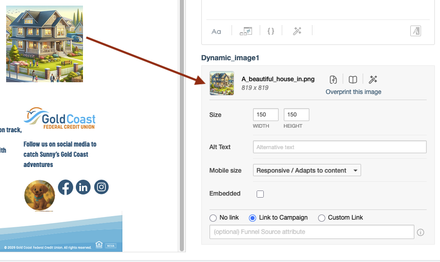
Once placed in the template, you can then configure its specific properties in the campaign settings where it will be used. The following options are available after adding the template in the email channel and clicking on the dynamic image component to edit it:
- Image Upload: Use the link Overprint this image to replace the default image with a campaign-specific one. The original image dimensions and filename are displayed for reference.
- Size: Define the exact width and height of the image in pixels.
- Alt Text: Provide alternative text that will be displayed if the image cannot be loaded.
- Mobile Size: Choose how the image behaves on mobile devices. Options include responsive sizing that adapts to the content or fixed dimensions.
- Embedded: Check this option to embed the image directly in the email rather than linking to an external source.
- Link Options: Configure how the image behaves when clicked. Choose from No link, Link to Campaign, or Custom Link to set a specific destination URL.
- Funnel Source Attribute: Optionally specify a funnel source attribute to track the origin of clicks or interactions with the image.
By configuring these properties at the campaign level, you can reuse the same email template across multiple marketing efforts, quickly adapting the image content without having to rebuild the template each time.
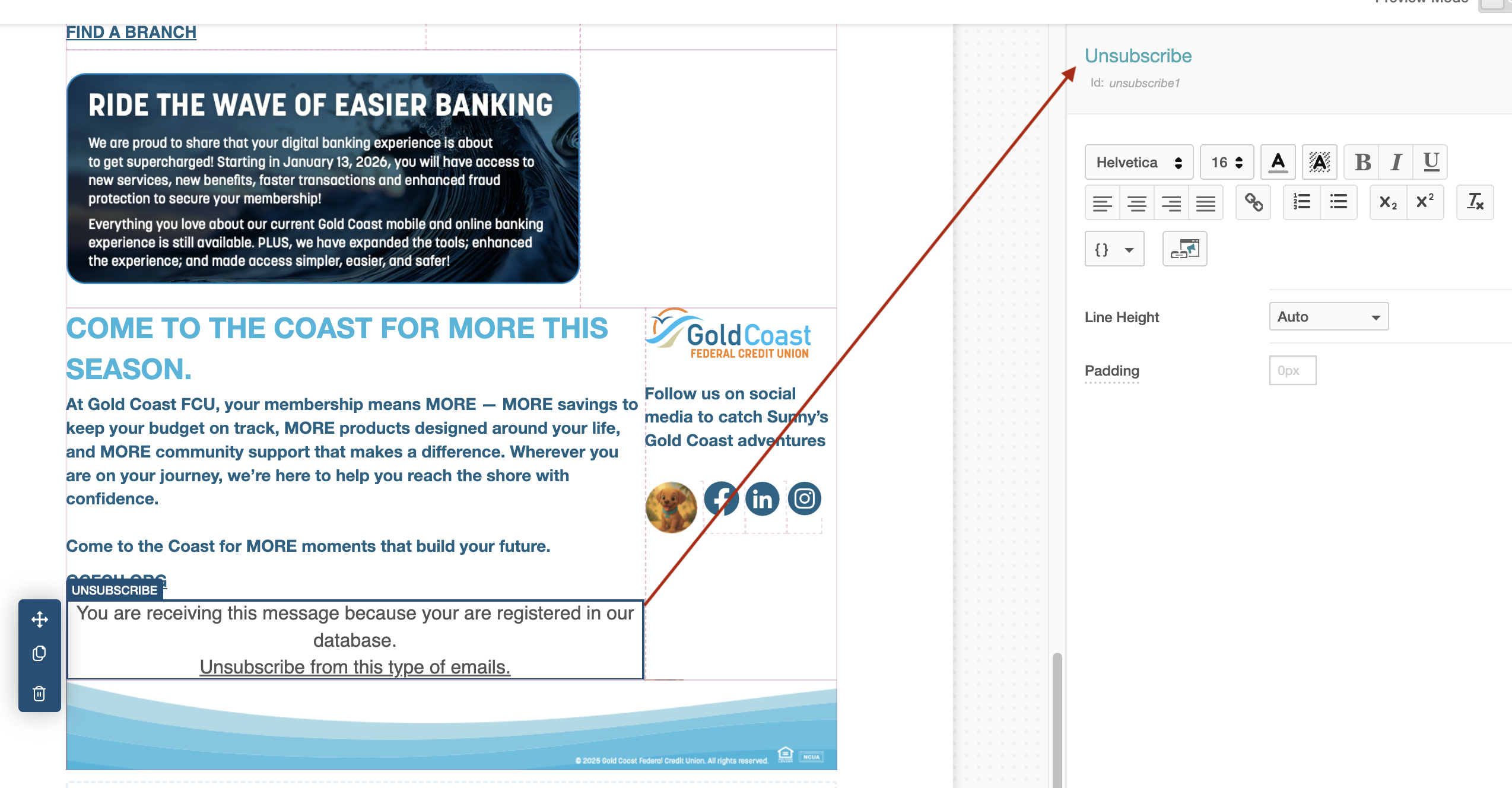
Unsubscribe #
The Unsubscribe component adds a link to the email that allows recipients to opt-out from future communications. When added to the design, it will appear as a link (where you can edit both the text and the target URL). You can also change the format, align the text, add a background color, and more.
View in Browser #
The View in Browser component provides a link for the recipient to open the email in a web browser. This is useful if the email client has trouble rendering the content correctly.
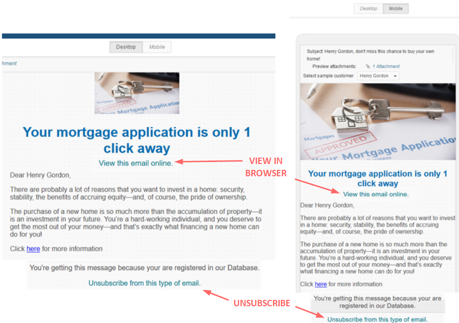
If you have translations for your email, you can configure the link to point to the correct language version. To do so, ensure that the href attribute of the link points to {{email.webview}} for the default language, {{email.webview:es}} for Spanish, {{email.webview:fr}} for French, and so on.
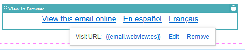
In all cases,
{{email.webview}}depends on the default language from Settings/Languages in your instance of Prisma Campaigns.
Communication preferences #
The Comm. Preferences component provides a link to a page where users can manage their communication preferences in a more granular way than a simple unsubscribe. This gives them more control over what kind of messages they receive.
Conditional Display #
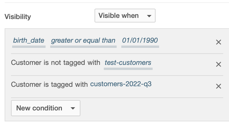
Most components allow you to toggle their visibility or set it based on a condition. The following shows an example using the panel component:
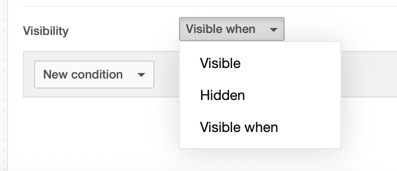
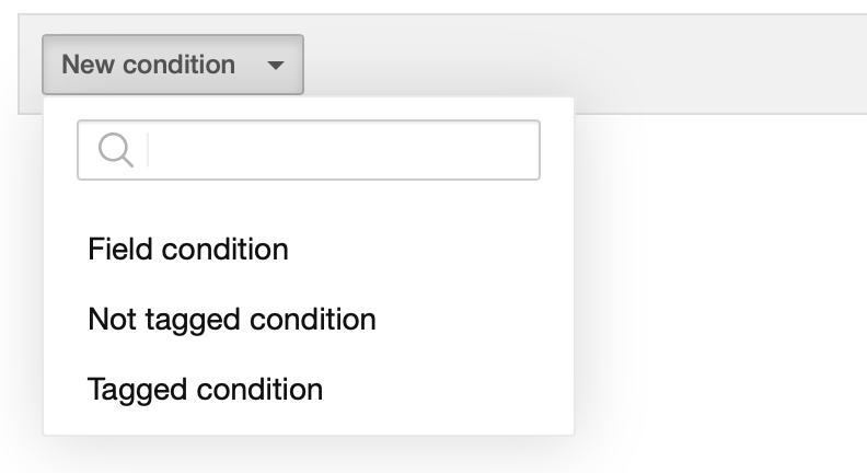
As you can see in the image above, the panel can be configured to be visible conditionally. This can be achieved by setting one or more of the following options related to the customer’s data:
Filter condition: for example, their birth date is exactly or after January 1st, 1990.
Not tagged condition: for example, customers who are not tagged with the test-customers tag.
Tagged condition: for example, customers who are tagged with customers-2022-q3.
The image below shows the examples of the different conditions that can be set: